Real-World Examples of Aurelia's Compose Tag

Photo by James Baldwin on Unsplash
When I first learned about the
<compose> element
I thought I'd use it everywhere. Well, in about 16 months I've been using
Aurelia full-time, I think I personally have only used it twice, but I'm sure
I'll use it more as we build out more reusable components.
The <compose> tag let's you dynamically insert custom components. It turns out
that most of the time I don't need this because I know exactly what elements I
want to use.
So when does it make sense to use <compose>. Here are the two instances I have
used it.
Pattern Library
Our UI/UX team has developed a pattern library with code examples for our team to use. This lets us keep our styles consistent as we develop new pages.
The way we have it set up, each of the pages has a similar design and layout.
Each pattern category is in a directory called patterns. There is a directory
for each pattern with a similar structure.
So here is an excerpt of app.js:
export class App {
    configureRouter(config, router) {
        config.addPipelineStep('authorize', AuthorizeStep);
        this.router = router;
        config.title = 'Pattern Library';
        config.map([
            {
                route: '',
                name: 'intro',
                moduleId: './patterns/intro/index',
                nav: true,
                title: 'Intro',
            },
            {
                route: 'accordions',
                name: 'accordions',
                moduleId: './patterns/accordions/index',
                nav: true,
                title: 'Accordions',
            },
            ...
So you can see our Accordions section is located in patterns/accordions
Here is the patterns/accordions/index.html component.
<template>
  <require from="../../components/pattern-index"></require>

  <pattern-index
    title="Accordions"
    patterns="accordions/patterns"
    links.bind="links"
  ></pattern-index>
</template>
Notice we are importing a pattern-index component. Here is what that component
looks like:
pattern-index.html:
<template>
  <div class="fader-side-bar  fader-side-bar--top"></div>
  <div class="layout__middle__side">
    <div class="layout__middle__side__inner">
      <ul class="nav  nav--stacked">
        <li class="${link.class}" repeat.for="link of links">
          <a click.delegate="subNavActivate($index)" href="#${link.href}"
            >\${link.title}</a
          >
        </li>
        <li class="push-bottom-medium"></li>
      </ul>
    </div>
  </div>
  <div class="fader-side-bar  fader-side-bar--bottom"></div>

  <div class="layout__middle__main">
    <h1>${title}</h1>
    <compose view="../patterns/${patterns}.html"></compose>
  </div>
</template>
pattern-index.js
 import {bindable, containerless} from 'aurelia-framework';

@containerless export class PatternIndex { @bindable title = 'INCLUDE TITLE
ATTRIBUTE'; @bindable patterns; @bindable links;

    subNavActivate(index) {
        const linkCount = this.links.length;

        for (let i = 0; i < linkCount; i += 1) {
            this.links[i].class = '';
        }

        this.links[index].class = 'active';
        return true;
    }

}
So for the purpose of this article, there are really only two things to
highlight. Here is where we are calling the pattern-index component:
<pattern-index
  title="Accordions"
  patterns="accordions/patterns"
  links.bind="links"
></pattern-index>
Notice we pass in the patterns attribute.
And this is how we use the compose tag in the component:
<compose view="../patterns/${patterns}.html"></compose>So basically we replacing the <compose> tags with the
patterns/accordions/patterns.html component, which looks like this:
<template>
  <require from="./accordion-basic"></require>
  <require from="./accordion-close-others"></require>

  <accordion-basic></accordion-basic>
  <accordion-close-others></accordion-close-others>
</template>
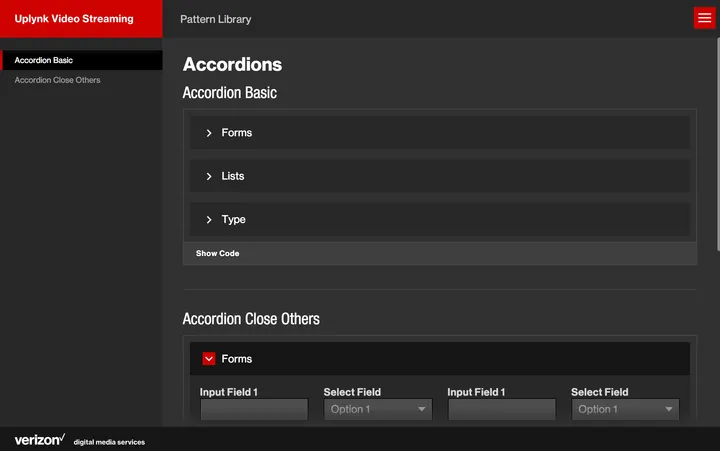
Here is an example of the accordion page:

Data Table
I won't go so deep into this one, but basically give you a high level overview.
We have a <data-table> component in our system where you can bind an array of
objects and basically print them out in a table. It is a very useful component
and we use it in a number of places.
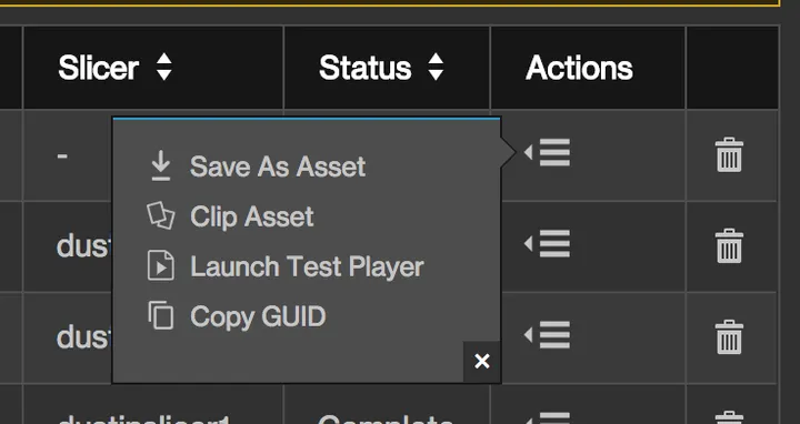
The problem is that sometimes you might want a column that doesn't have anything to do with your data. For example, we have one table that has a menu of actions for each row of data. This column is only applicable to this particular data array.

So how do we add this in to our table? Here is what our data-cell.html portion
of our component looks like:
<template>
  <require from="./record-value"></require>

  <div
    data-th.bind="col.label"
    get-class.call="col.getClass(record)"
    class.bind="cls"
  >
    <compose
      if.bind="col.view"
      view.bind="col.view"
      view-model.bind="col.viewModel"
      model.bind="{record: record}"
    ></compose>
    <record-value
      if.bind="!col.view"
      prop.bind="record[col.key]"
      record.bind="record"
      get-value.call="col.getValue(record)"
      title="${col.getValue(record)}"
    ></record-value>
  </div>
</template>
Standard data in the array will use the <record-value> component, but if we
want to we can specify a view and view-model to use for this column and it
will be generated in this column.
We could probably refactor this code to have the <compose> render the
<record-value> component if a view and view-model are not specified. Then we
can remove the if.bind and simply have the <compose> tag there.
Hopefully this has been helpful. Feel free to share a comment in areas where you
have found <compose> useful.
 Try EnvelopeBudget - Your grandparents' budget for the modern
age
 Need a custom website, app, or automation? Let's talk
